CircleCI's 20 Why's
Let’s put ourselves in the shoes of a CircleCI customer. Probably a trusty pair of Birkenstocks. They login and they’re greeted with a “Dashboard” which looks a little something like this:
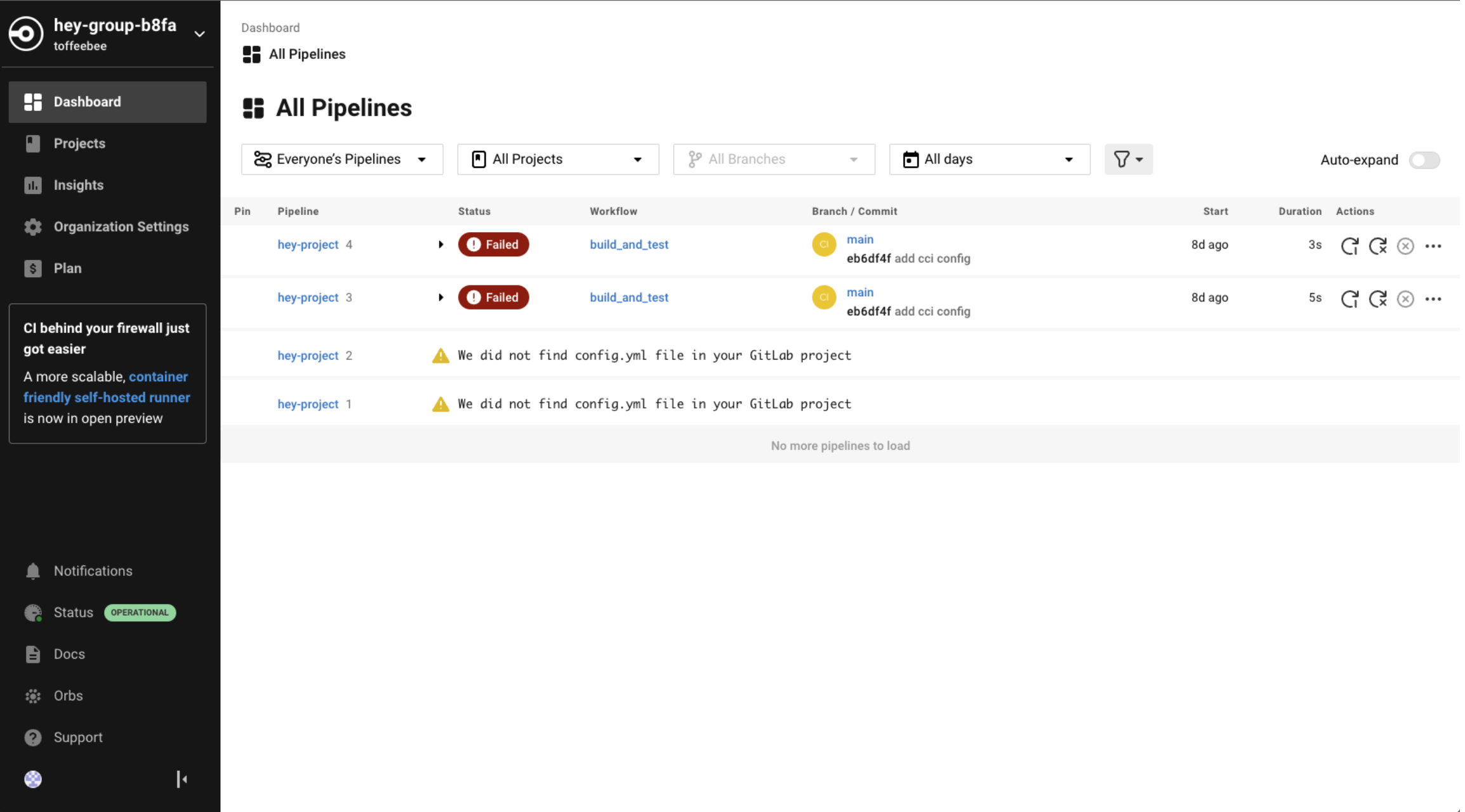
I’m going to dissect this page, feel free to open up https://app.circleci.com as your own user if that’s easier to follow. Let’s hone in on a section of this page:
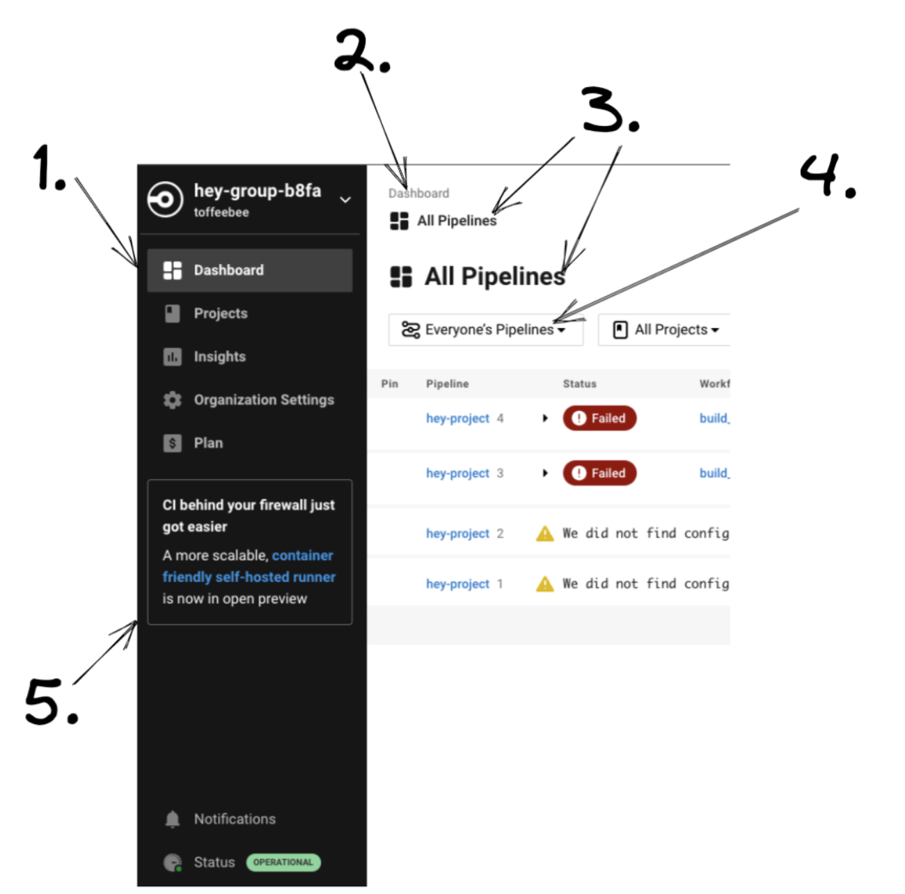
- To the left of the word “Dashboard” is a sort of, broken mirror icon. Is this icon supposed to refer to the “Dashboard”? If so, why is this broken mirror icon also next to the words “All Pipelines” on the righthand side?
- Why do we have “Dashboard” written here? We already know we’re on the “Dashboard”, it’s highlighted on the left, do we need it written again?
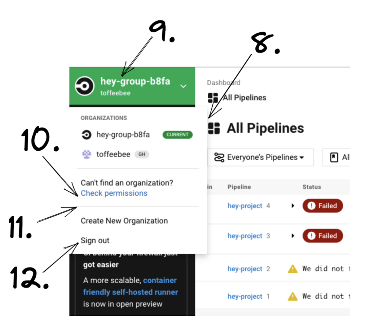
- Why do we have “All Pipelines” written in a small font, and then “All Pipelines” written again in a slightly bigger font? Do we need it written twice?
- Why not go for a hat-trick and call this dropdown “All Pipelines” too? Also, there is only one user in this organisation, why can I toggle between “Everyone’s Pipelines” and “My Pipelines” - they’re all me.
- Oh CI behind my firewall just got easier, that’s great. Do I have to read this message forever, isn’t this something that I should be able to dismiss, like a notification? If it were a notification, can I opt out of receiving it and others like it?
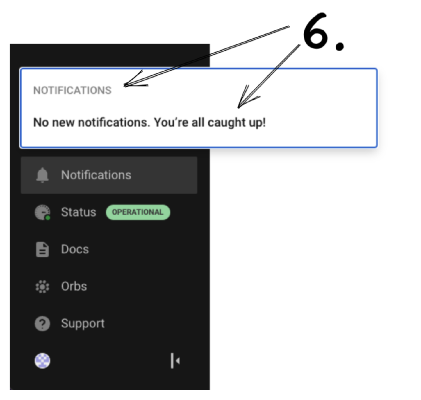
- If I click on the “Notifications” tab it opens a popup with a header called “Notifications”. Do we really need that second “Notifications” header? Oh sweet I’m all caught up! Uh, what kind of stuff even goes here? Am I supposed to keep an eye on this or something? Can I see previous notifications? Can I turn them off? Can I get notified by email instead? Why isn’t the message about “CI behind your firewall just got easier” here?
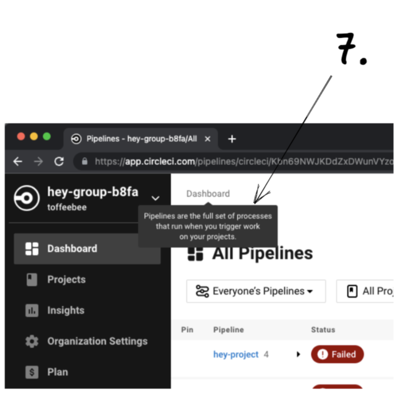
- If I hover over the redundant “Dashboard” text it tells me what “Pipelines” are. Shouldn’t the redundant “Dashboard” text tell me what a “Dashboard” is? This is the only text that gives a definition when you hover over it in the entire CircleCI app btw. Well, it looks to me like “Dashboard” and “Pipelines” are the same thing. Can we ditch the concept of a “Dashboard” and just call the tab “Pipelines”?
- The dropdown options are slightly wider than the dropdown button itself.
- If I click my organisation name in the top left it turns green and opens a dropdown. Why do we have a green pill called “CURRENT” to the right of this organisation’s name? Isn’t it clear “hey-group-b8fa” is my currently selected organisation - I mean it is bright green. Also, to the right of the organisation called “toffeebee” there is a grey pill called “GH”. That stands for GitHub if it wasn’t blindingly obvious. What about “hey-group-b8fa”, where is the grey pill for that?
- Why is “Can’t find an organization?” in black text and “Check permissions” in blue text? Both pieces of text are part of the same button.
- Why is there a divider here? And Why Is Every Word In “Create New Organization” Capitalised?
- This drop down seems like it’s related to organisations, internally we refer to it as “The Org Picker”. Yet I can sign out of my user here? Shouldn’t that be an action related to clicking on my user profile? If we want to keep it here (I don’t think it makes sense to do that) maybe we should put a divider above it?
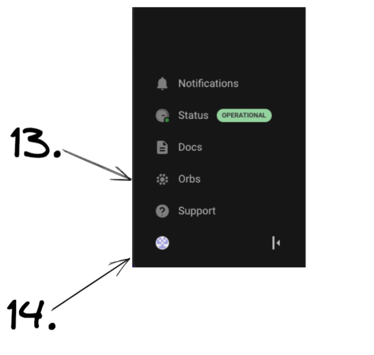
- Right below a link called “Docs” is a link called “Orbs". The “Docs” link goes to our documentation and the “Orbs” link goes to our documentation on Orbs. Why is there a dedicated link to the Orbs documentation here? Is Orbs somehow special from all the other parts of our documentation?
- To access my user settings I have to click a super duper small avatar icon down here, why is it almost hidden away? Shouldn’t we write “User Settings” next to it or something?
Ok let’s click the super duper small avatar icon to access our user settings:
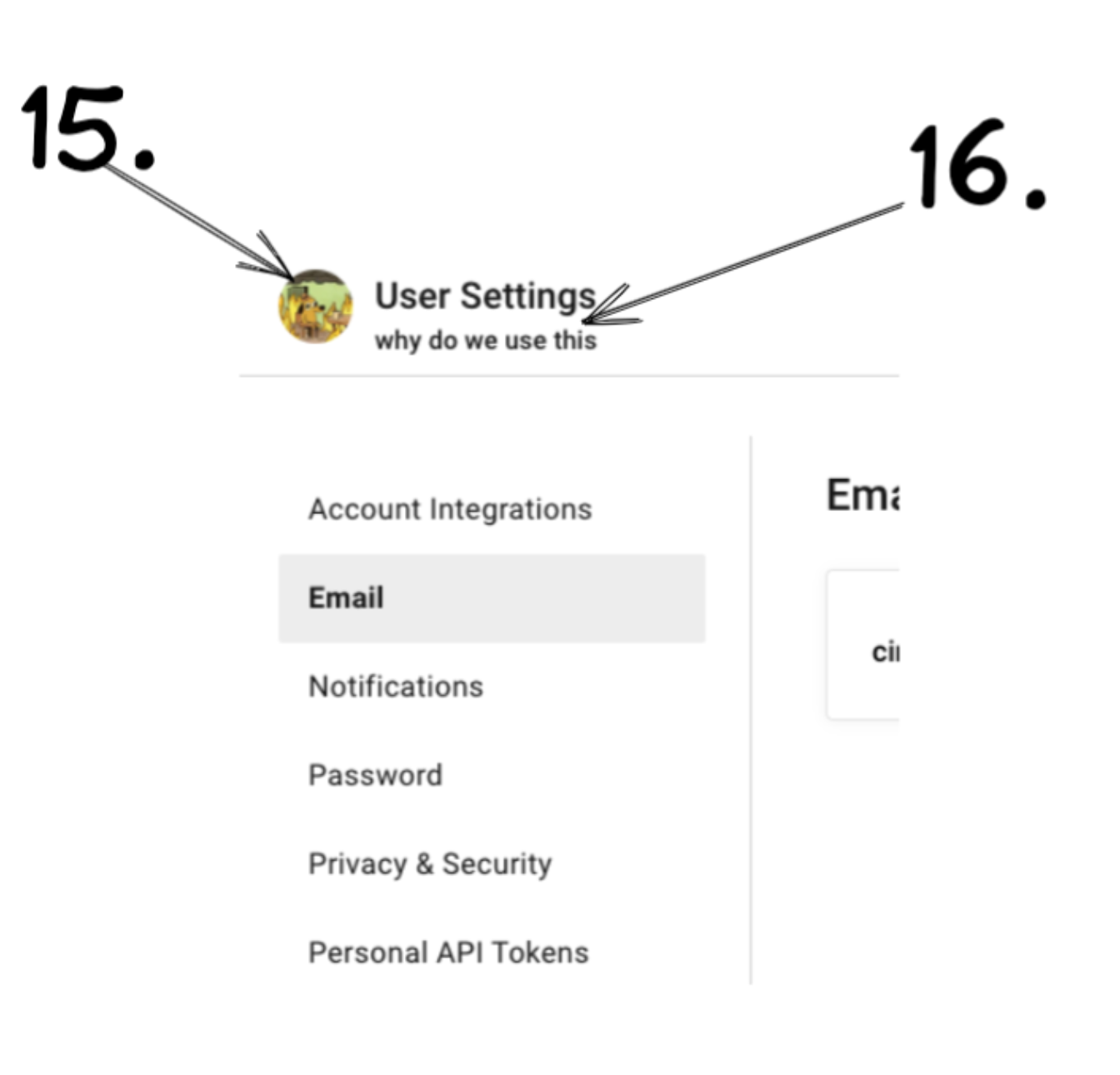
- This user has multiple identities; a GitHub identity and an email/password identity which is connected to GitLab. On github.com I updated my GitHub avatar to be a picture of a cartoon dog sitting in a house on fire. Why do we use this GitHub avatar for my user settings and not the GitLab avatar? What if a user had a GitHub, a Bitbucket and a GitLab identity + many other sources of change integrated with their user, why would we use a GitHub avatar here?
- On github.com I updated my GitHub profile name to be “why do we use this”. Ahem, why do we use this GitHub profile name in the “User Settings” page and other parts of CircleCI? GitHub is just an identity but we treat it like it’s a user.
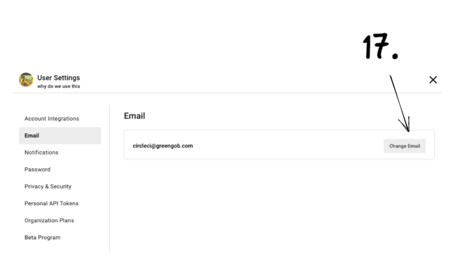
- Which email are we changing here? If a customer connected a GitHub, Bitbucket and GitLab identity to their user and clicked this button, which of those email addresses would this button change? Is your answer obvious to the end user?
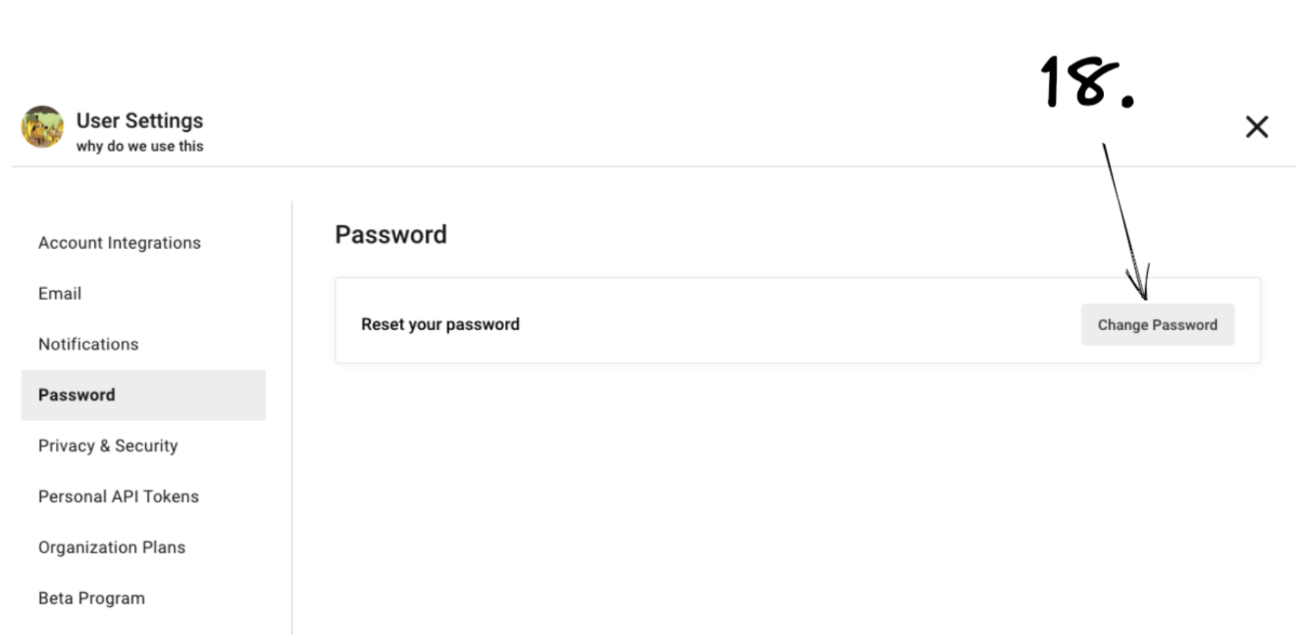
- This “Change Password” button is inside a tab on the left called “Password”. The password that gets changed is associated to the email on the “Email” tab in the picture above. Why are they on separate tabs? Is it obvious they are associated with each other?
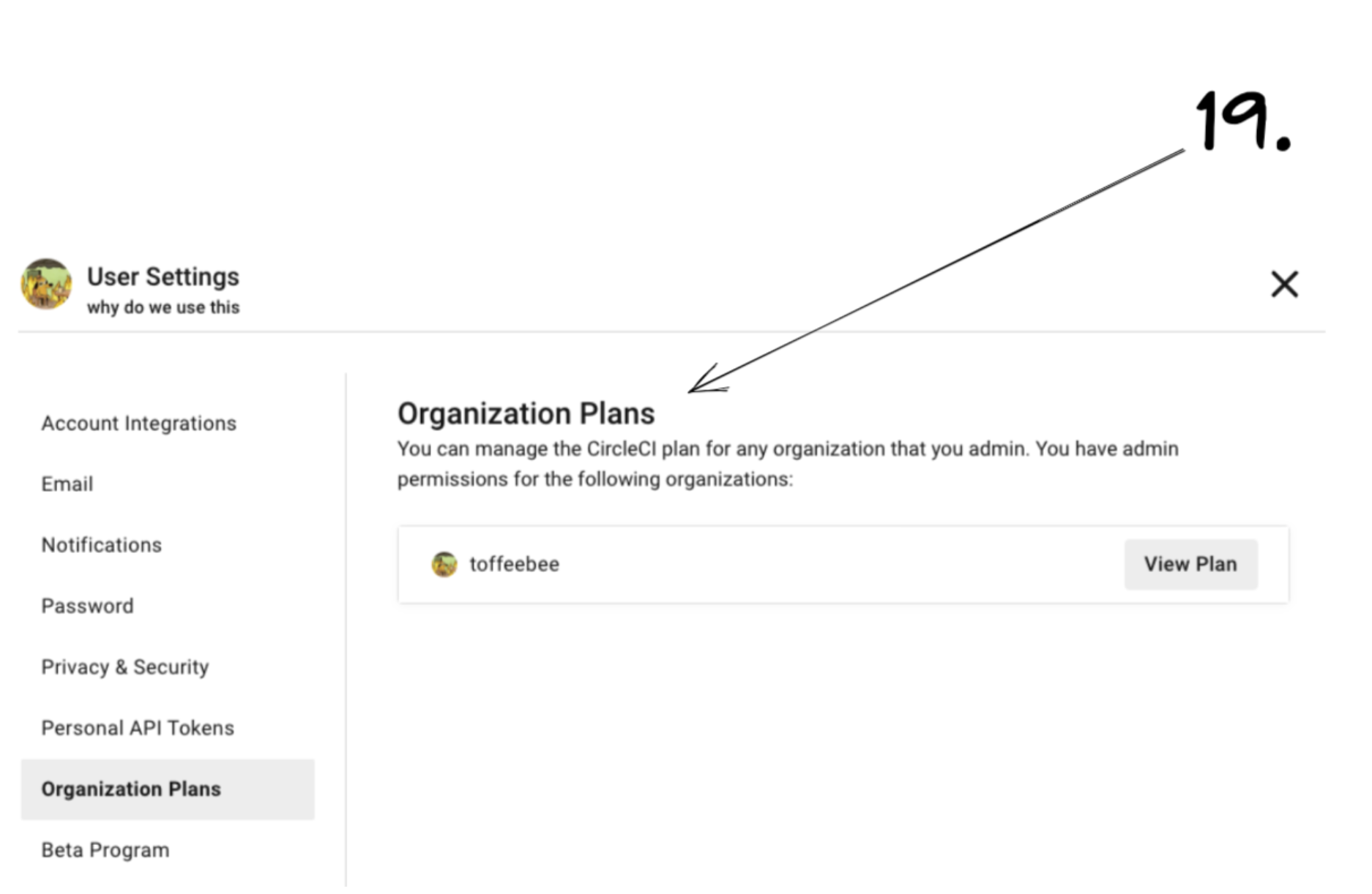
- I can manage my organisation plans in here? I thought this was the “User Settings” page? Why would this setting be in here?
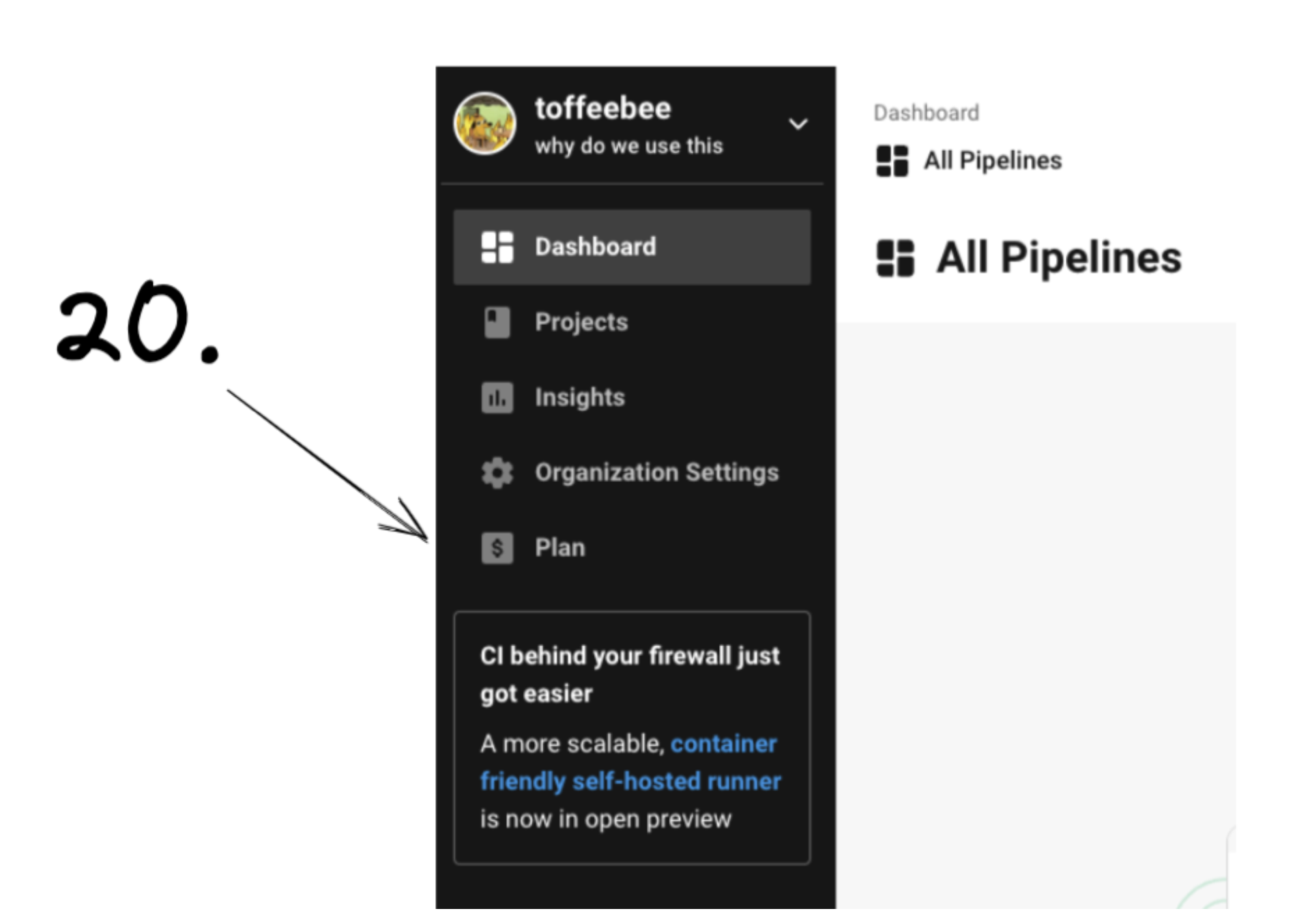
- Oh I can access my organisation’s plan here too. But interestingly I can’t access my organisation’s plan inside the “Organization Settings” tab, but I can access it inside my “User Settings” tab (as long as I click the super duper small avatar icon).
Music